Why OKLCH Is Changing How We See the Web
Why Are We Still Talking About Colour?
For years, web developers have defined colour using systems built for machines, not people. When we write #4A90E2 or rgb(255, 0, 0), we’re describing how a display produces colour — not how a human perceives it.
As digital interfaces evolve across millions of screens and accessibility expectations rise, these machine-centric models have begun to show their limits. We need colour systems that understand how eyes see, not how monitors glow.
That’s where OKLCH comes in — a modern, perceptually accurate model that brings predictability, harmony, and accessibility to interface design. But to appreciate why it matters, we must trace how web colour has evolved.
Perceptually uniform colour spaces such as OKLCH allow designers to change lightness or chroma numerically and get visually consistent results across different hues — something legacy RGB and HSL models cannot reliably guarantee.
The Foundation: RGB-Based Models (What We Know)
Hex Codes (#RRGGBB)
What it is: A six-digit shorthand for red, green, and blue values, for example, #4A90E2.
Why we use it: It’s compact, universal, and easy to copy-paste — the lingua franca of web colour for decades.
The limitation: It’s not human-readable. #4A90E2 tells you nothing about how light or vivid it is. It’s also locked to the limited sRGB colour space, which means it can’t represent the more vibrant hues modern displays can show.
RGB / RGBA (rgb(255, 0, 0))
What it is: An explicit declaration of red, green, and blue values — with an optional alpha channel (rgba()) for transparency.
Why we use it: It offers precise control and makes opacity simple to adjust.
The limitation: Like Hex, RGB describes how screens emit light, not how humans experience it. If you want to “make a colour 20% lighter,” you’re left guessing — because the relationship between RGB values and perceived brightness isn’t linear or predictable.
The First Step Forward: HSL (A More Human Approach)
The next major leap came with HSL, or hsl(Hue, Saturation, Lightness).
Why it was a game-changer: HSL allowed developers to think in visual terms:
- Hue defines the colour on a wheel (0–360°).
- Saturation controls how vivid the colour is.
- Lightness adjusts brightness.
Changing the hover state of a button became intuitive — just tweak the Lightness value.
The Hidden Flaw: The “Lightness Lie”
Unfortunately, HSL’s Lightness isn’t perceptually accurate.
For instance:
hsl(60, 100%, 50%)  /* Yellow */
hsl(240, 100%, 50%) /* Blue */
Both have 50% lightness — yet yellow appears brighter than blue. This inconsistency breaks accessible design systems. Two colours with the same “lightness” may still fail contrast checks, confusing both designers and assistive tools.
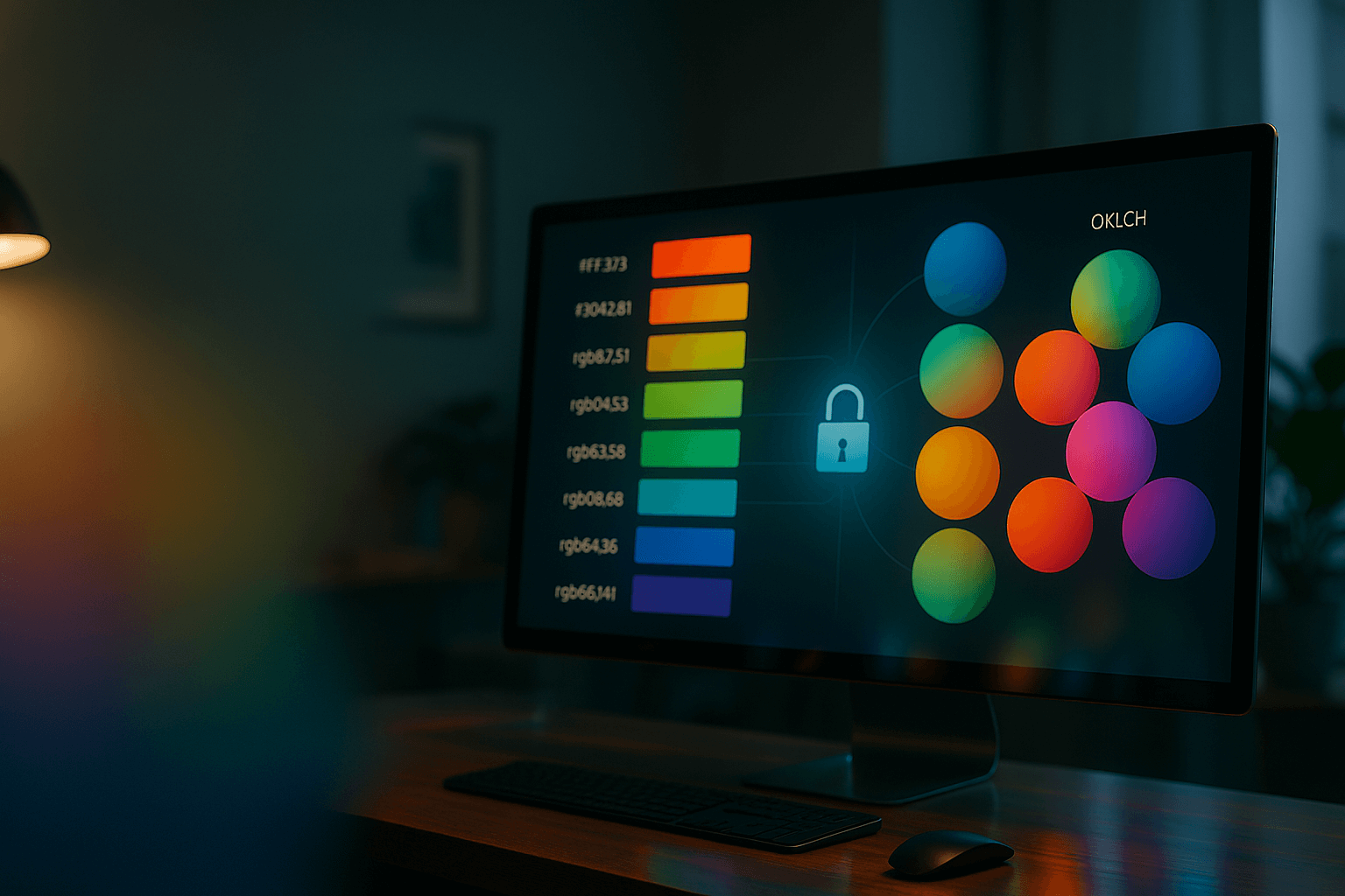
The Modern Standard: OKLCH (Colour as We See It)
What Is OKLCH?
oklch(Lightness, Chroma, Hue) is a perceptually uniform colour model derived from advanced colour science.
Each parameter directly maps to how humans perceive colour:
- L = Lightness
- C = Chroma (intensity or saturation)
- H = Hue (position on the colour wheel)
The Core Advantage: Perceptual Uniformity
This is the major breakthrough. A change of 0.1 in Lightness (L) or Chroma (C) produces a visually consistent difference, no matter what the hue is.
oklch(0.7 0.1 60)  /* Yellow */
oklch(0.7 0.1 240) /* Blue */
Both genuinely appear equally bright — something older systems could never guarantee.
Why This Shift Matters
| Feature | Hex / RGB | HSL | OKLCH |
|---|---|---|---|
| Human Readability | Poor | Good | Excellent |
| Intuitive Manipulation | Poor | Good | Excellent |
| Predictable Lightness | No | No (“Lightness Lie”) | Yes (Perceptually Uniform) |
| Accessibility (Contrast) | Difficult | Unreliable | Reliable & Predictable |
| Colour Range (Gamut) | Limited (sRGB) | Limited (sRGB) | Wide (sRGB, P3, and beyond) |
OKLCH marks a change in philosophy: from telling the computer how to display a colour to describing how we perceive it.
It brings benefits across three critical fronts:
1. Predictable Theming
When building light and dark modes, you can safely adjust the L value to brighten or darken colours — no trial and error required.
2. Built-in Accessibility
Contrast ratios depend on perceived brightness. Because L represents actual lightness, text contrast checks become consistent and reliable.
3. Wider Colour Gamut
OKLCH supports the Display P3 colour space, meaning your designs can finally use the vivid colours modern screens can reproduce. What once looked “flat” can now look alive.
How to Use OKLCH in Practice
Browser Support
Modern browsers (Chrome, Safari, Firefox, Edge) now fully support OKLCH. Even older browsers gracefully fall back to standard sRGB colours.
Finding and Testing Colours
Use online converters or browser developer tools. Many colour pickers, including Google’s and Figma’s advanced models, now include OKLCH by default.
Example Implementation
:root {
  --primary: oklch(0.6 0.2 250);          /* Balanced blue */
  --primary-on-light: oklch(0.45 0.2 250); /* Darker for light backgrounds */
  --primary-on-dark: oklch(0.75 0.2 250);  /* Lighter for dark backgrounds */
}
This structure ensures predictable brightness across themes, improving both usability and brand consistency.
The Future Is Perceptual
The journey of web colour reflects a deeper shift in design philosophy:
- From how screens work (RGB),
- To how humans think (HSL),
- To how humans see (OKLCH).
Hex codes will still exist for quick reference, but perceptually uniform systems like OKLCH are the future of scalable, accessible, and truly human-centred design.
OKLCH isn’t just another colour format — it’s a visual language designed for human eyes. The more you use it, the more you’ll wonder how you ever worked without it.
Defining design tokens in a perceptually uniform space makes accessibility checks and theme scaling more dependable, because contrast and brightness adjustments map far more closely to how users actually see the interface.
Further notes...
To future-proof your design systems:
- Start defining colours in OKLCH, even if you maintain Hex for compatibility.
- Document your Lightness and Chroma values as design tokens.
- Periodically test accessibility contrast with live UI examples.
- Encourage your design and development teams to think visually instead of numerically.