Your Current Website Is Costing You More Than You Think

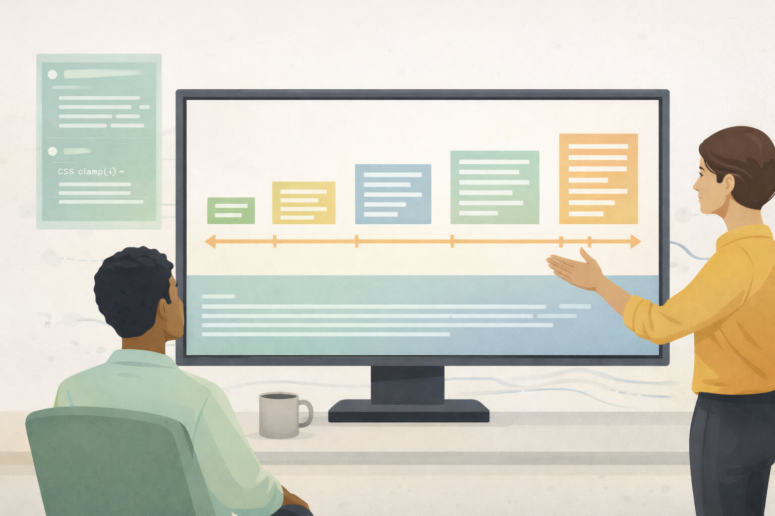
We are fixated on launch dates. A website “going live” is treated like a finish line — a moment to aim for, stress over, and eventually celebrate. Budgets get signed off. Deadlines get pushed. Everyone breathes out once it’s done. But nothing meaningful has actually…